Instagram Updated?!
May 18, 2016
The new Instagram update: you’ve probably heard about it, even if you don’t have an Instagram. After 5 years, the people behind Instagram have decided to change their look.
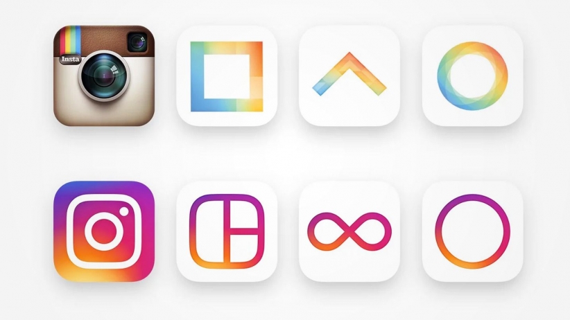
What once was the famous vintage camera icon has been replaced by a background of sunset gradient and a white outline of a camera. The inside of the app is simply a white layout which is supposed to “put more focus on your photos and videos without changing how you navigate the app,” as Instagram had said in a blog post.
Alongside the Instagram app, the icons of their other apps have changed, such as Layout, Boomerang, and Hyperlapse. Morgan Hargrove, a freshman said, “I think some parts of it look nice, but the icon looks too simple and plain. It’s a big change from what it used to be.”
A class poll revealed that 7 of 17 people said that they liked the layout but not the icon. Two people said that they liked the icon but not the layout. The majority of people who do have an Instagram don’t approve of this new change.
Freshman Serena Davis said, “To me Instagram is the same as before; they just changed the colors and the icon.”
Winston Green, senior at Bob Jones said, “I don’t know.. I think the old Instagram icon looked much better than the new one.”
In the end, some people love it and some don’t, which isn’t surprising. Not everyone likes change, but the only difference made is its appearance. Instagram stills works the exact same as before, just now with some small tweaks.


